Alison Bradfield is a pediatric physiotherapist who came to us needing a brand identity to reflect her warmth and passion. Ali was opening a new practice and knew that, in order to build a client base that trusted her with their little ones, she needed a professional brand identity.
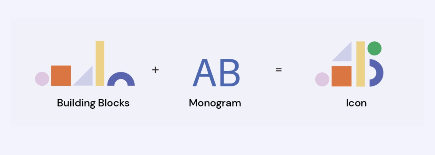
Icon & Brand Pattern
Centring around the idea of building blocks, we designed a family of colourful geometric shapes that make up the icon and the brand pattern. The simple yet playful design speaks to Ali’s caring and professional approach to her business.

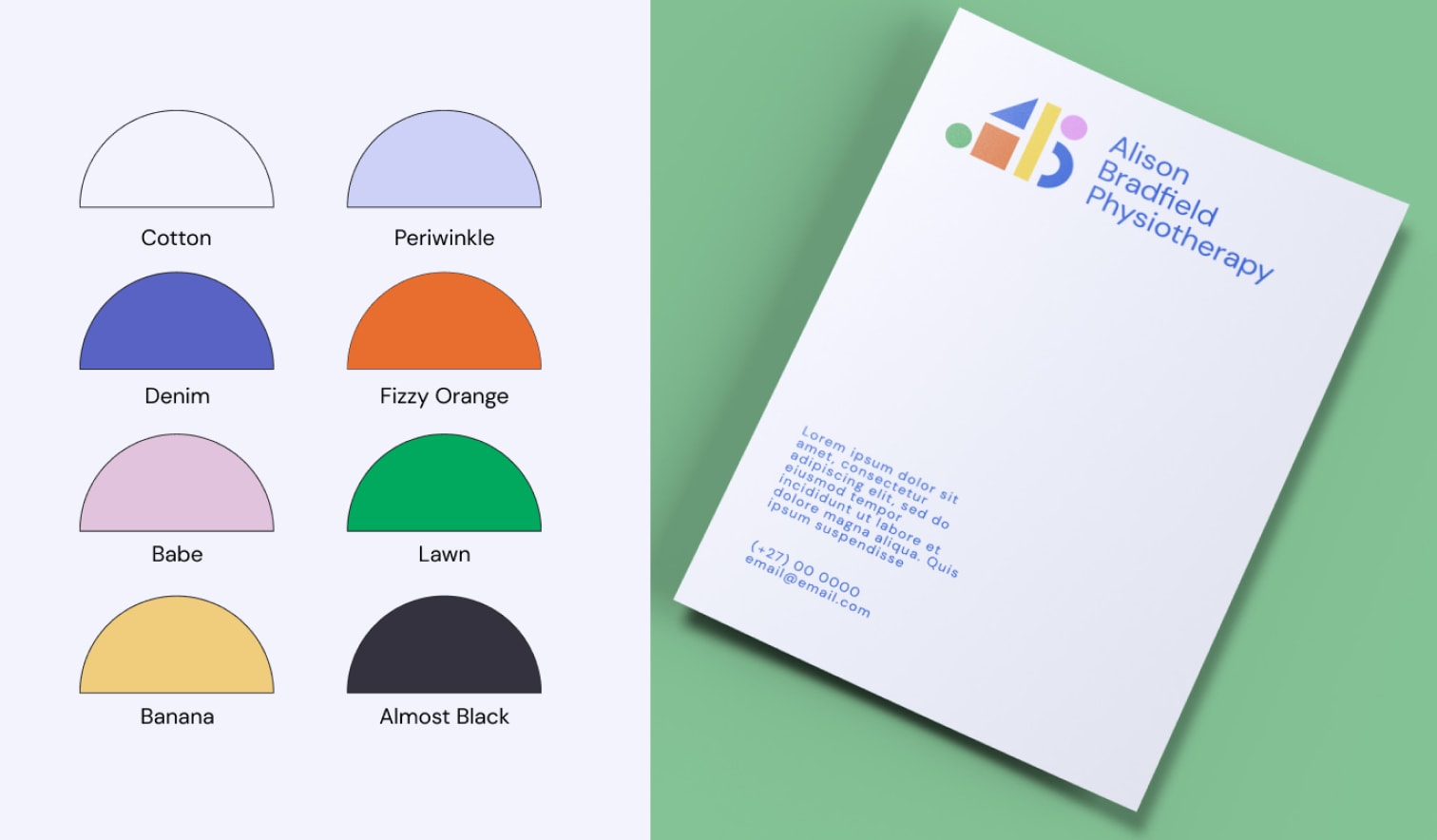
Colour Palette
We love colour naming and Ali’s colour palette is no exception. Researchers have found that up to 90% of snap judgments made about products are based on colour alone. Our goal for Ali’s colour palette was to communicate that she is knowledgeable and trustworthy but still fun and child-friendly.

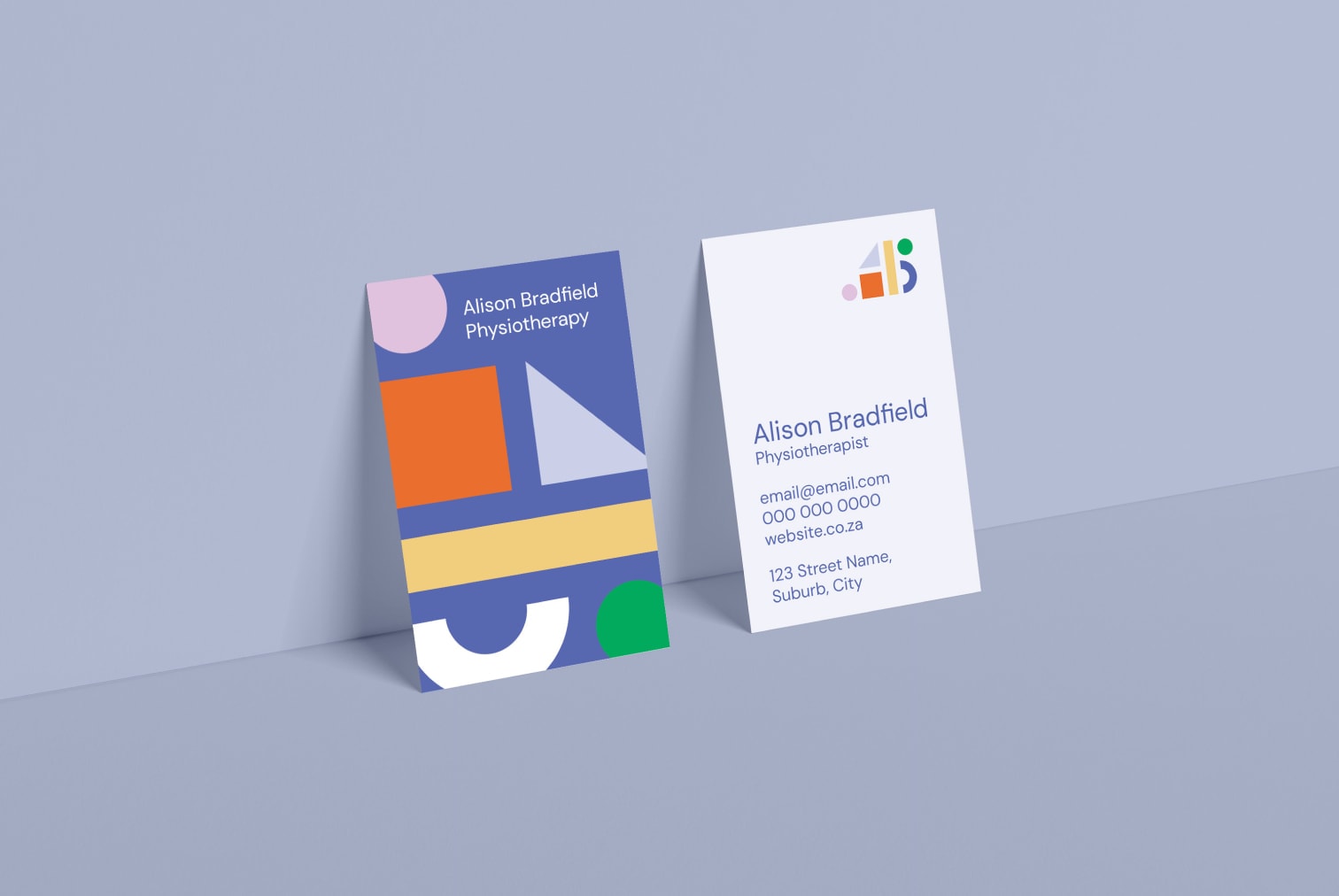
Business Cards
Business cards are a big must for physiotherapists. But in a pile of business cards, Ali’s needed to stand out. We ditched the typical landscape business card in favour of a portrait design. The bright colours and large shapes make it eye-catching and joyful.
Social Media Templates
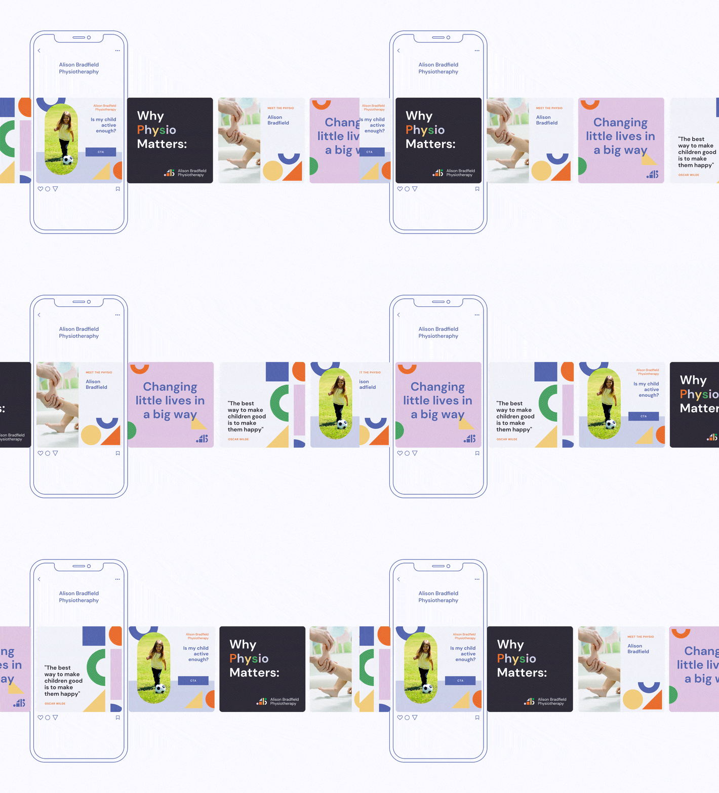
Templates make everything easier for our small business clients. We delivered a stack of social media templates for Ali to use across her social media channels. On top of this, we gave her guidance and encouragement to start making reels sharing her passion for paediatric physiotherapy.
Changing Little Lives in Big Ways
Ali is a wonderful example of a client who didn’t need too much. It’s so easy to get distracted by what competitors are doing but with Ali, we knew that simple branding and active social media pages would be far more worth the investment than building an entire website so early in the business journey.
Since the conclusion of this project, Ali has built a roster of young clients. She’s also moved practices and is looking forward to growing her business and hiring her first employee! Our team loves seeing Ali’s reels and is always there to hype her up in the comments.
