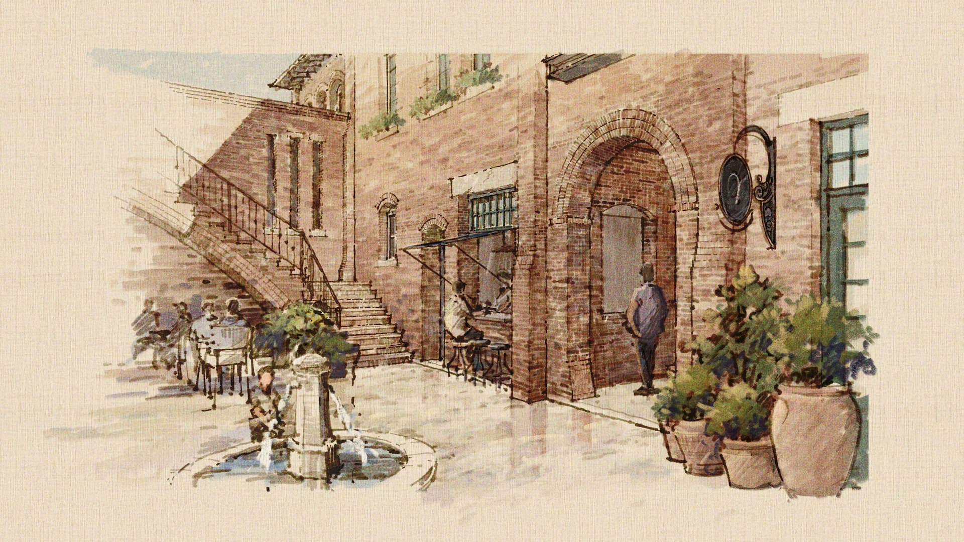
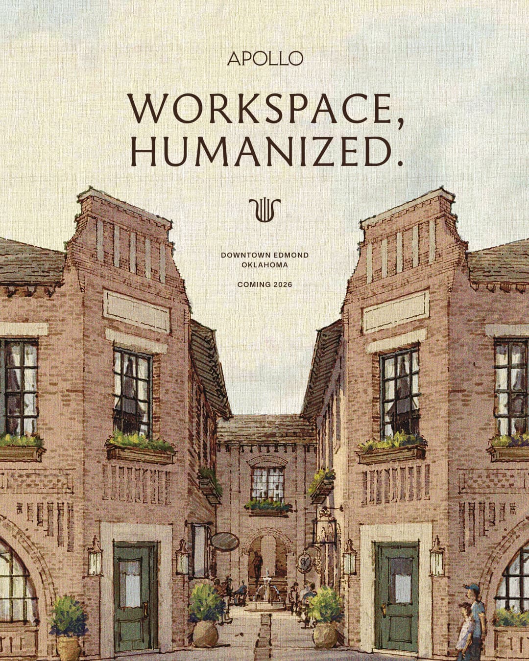
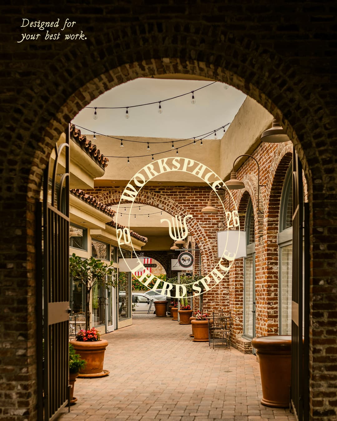
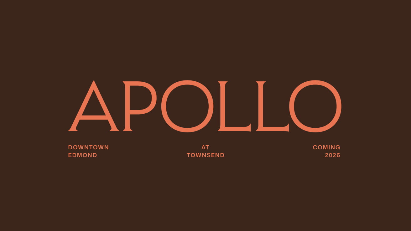
With small boutique retail spaces, a bustling courtyard to connect with peers and an intimate community of workspaces, Apollo at Townsend evokes the feelings of a vibrant, ancient marketplace. The excellent craftsmanship and vintage decor touches give the space an old-world European feel, inspiring the name Apollo, the God of Light.
Austin came to us wanting a simple new logo for Apollo that fit into their existing Townsend brand. After a few workshops, we soon realised that Apollo could be much bigger than that and we set out to create a full strategy, messaging and visual identity for the new brand. They wanted Apollo to live within the old-style Townsend universe but with a modern, fresh feel.
Brand Strategy
With Apollo, we set out to build a brand strategy that would do more than just look good on paper; it had to feel true to who they were and what they believed.
This was an evolving project. The strategy developed organically over time, and it was rewarding to see it take shape into something layered and clear. As a brand with multiple facets, from design and wellness to community and professionalism, we landed on the core idea that became the foundation of everything was:
Where Your Best Work Happens
These strategic pillars provided a strong, flexible foundation to build messaging that could adapt across channels while remaining true to Apollo’s purpose.
Messaging
With a clear strategy in place, we were able to take the messaging in focused, meaningful directions.
We centred the language around two core ideas:
- Apollo is for people who care about their work, their growth, and the quality of their environment.
- The smallest details matter, from natural light in every office to the rituals and materials that make great work feel possible.
By combining specificity with clarity, we crafted a voice that felt confident yet never loud, polished yet never sterile. The result was messaging that captured what made Apollo special: thoughtful spaces designed for serious professionals who want to do their best work.

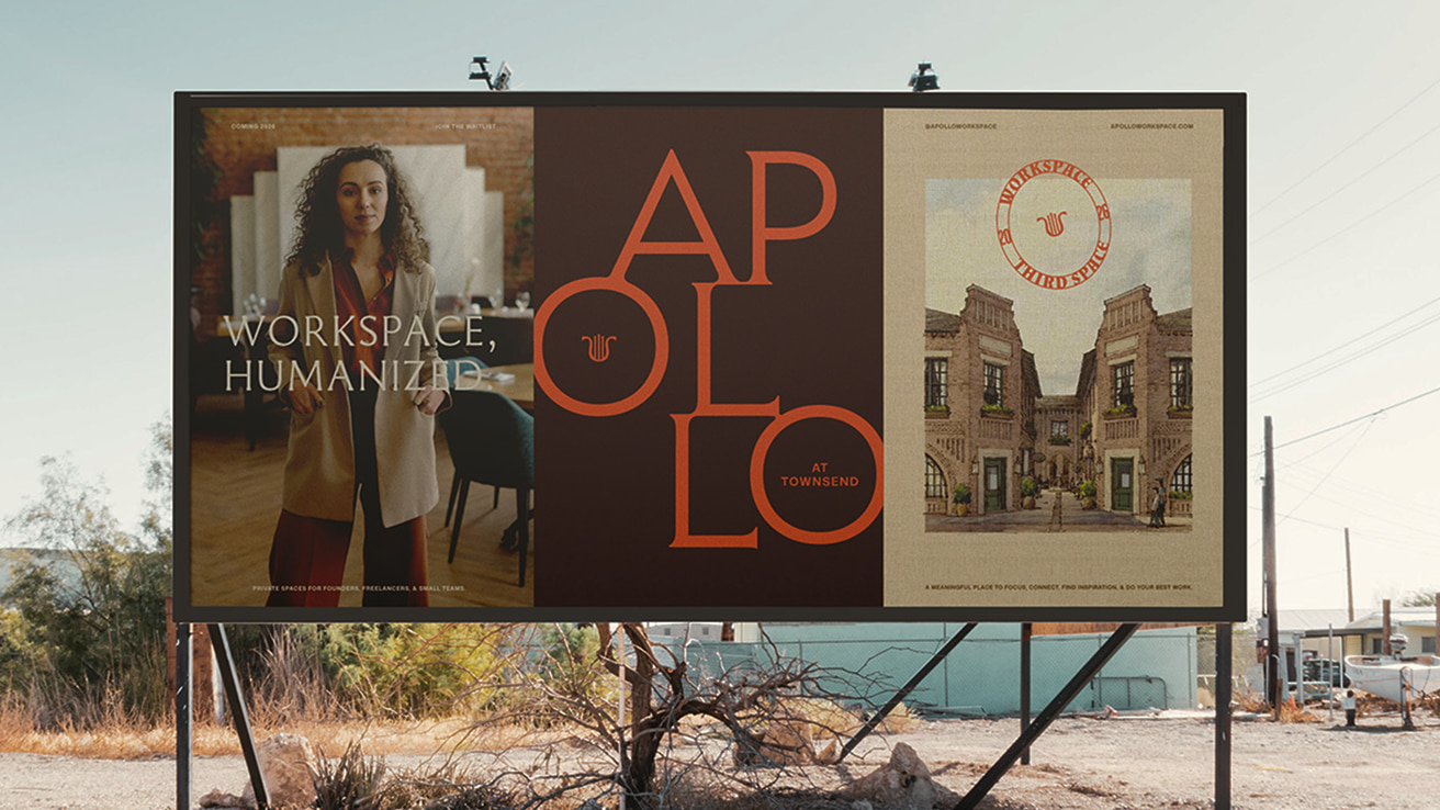
Visual Identity
The brand identity needed to seamlessly integrate with this environment, bridging its old-world charm and vibrant community spirit to connect with a modern audience. It aimed to feel both enduring and fresh.
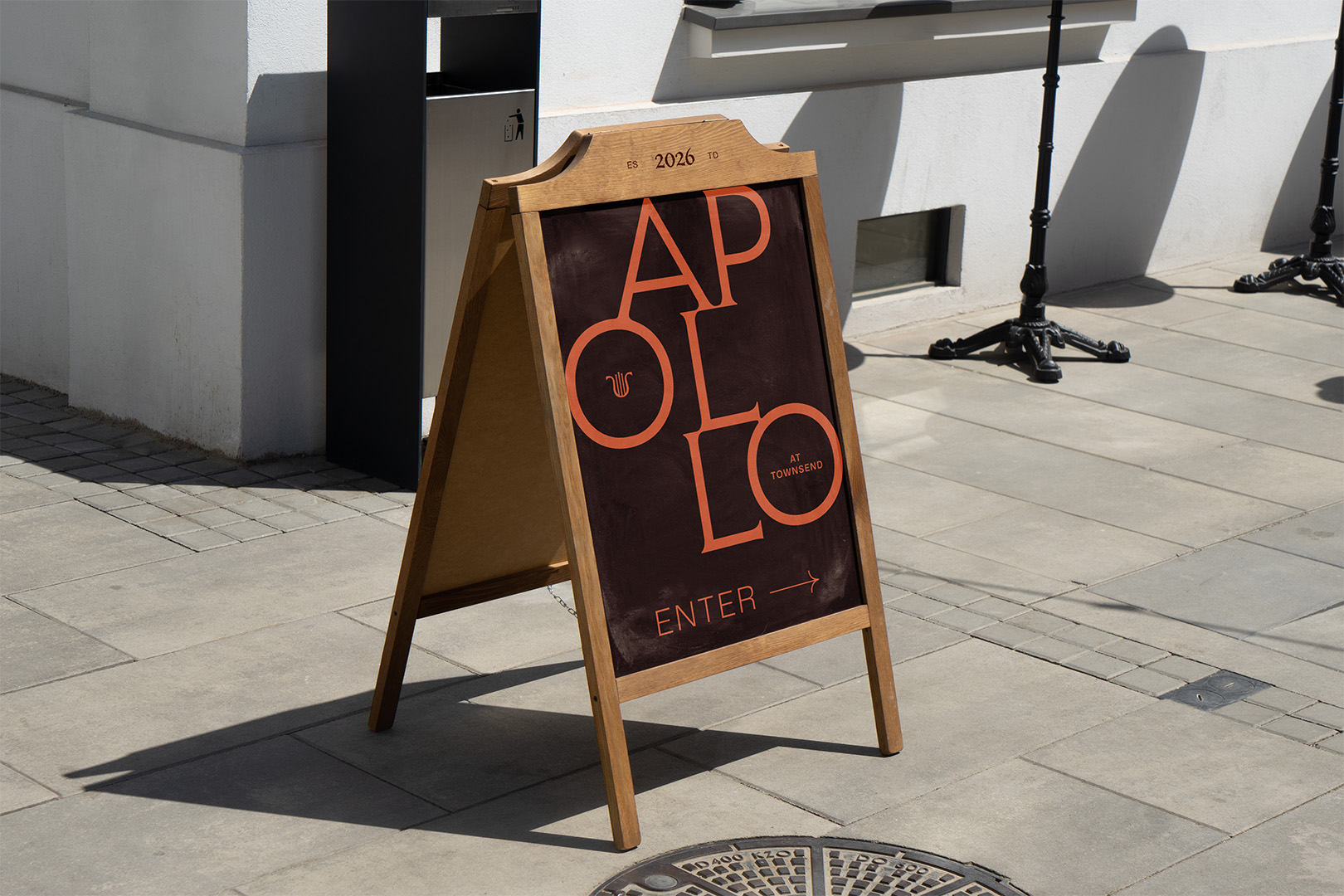
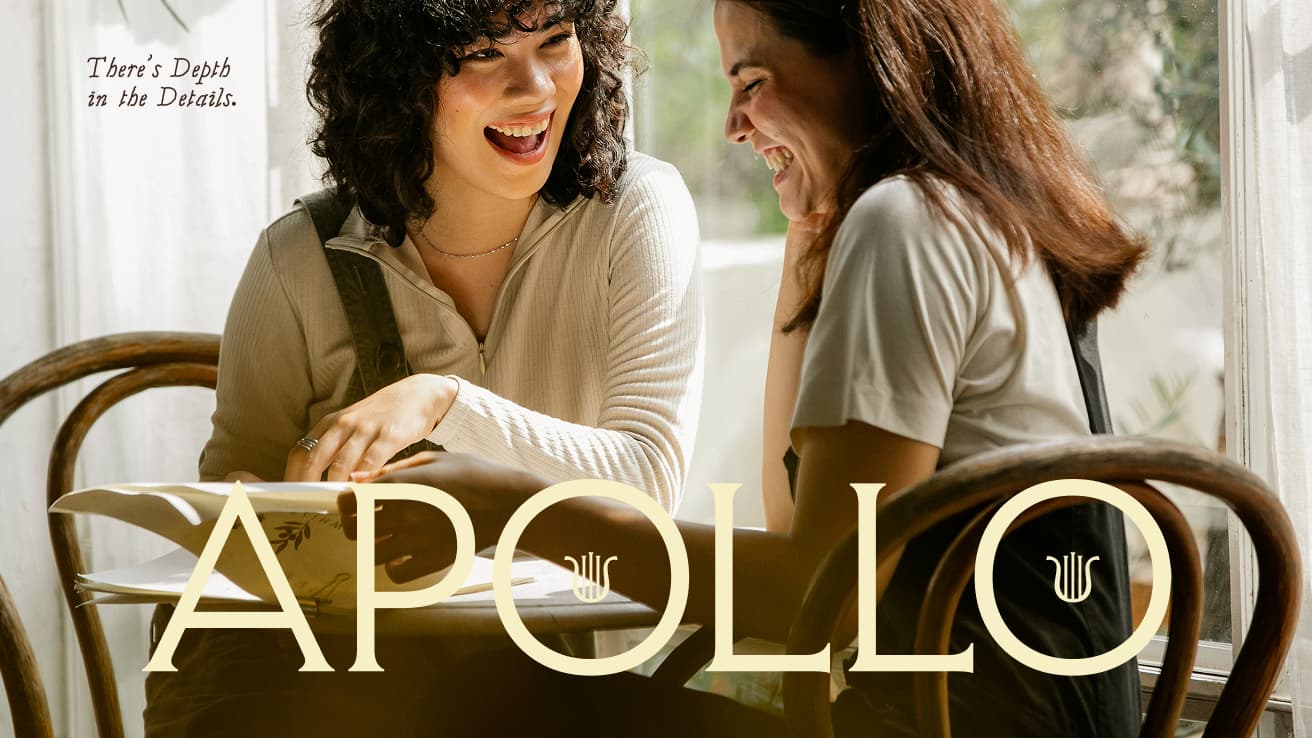
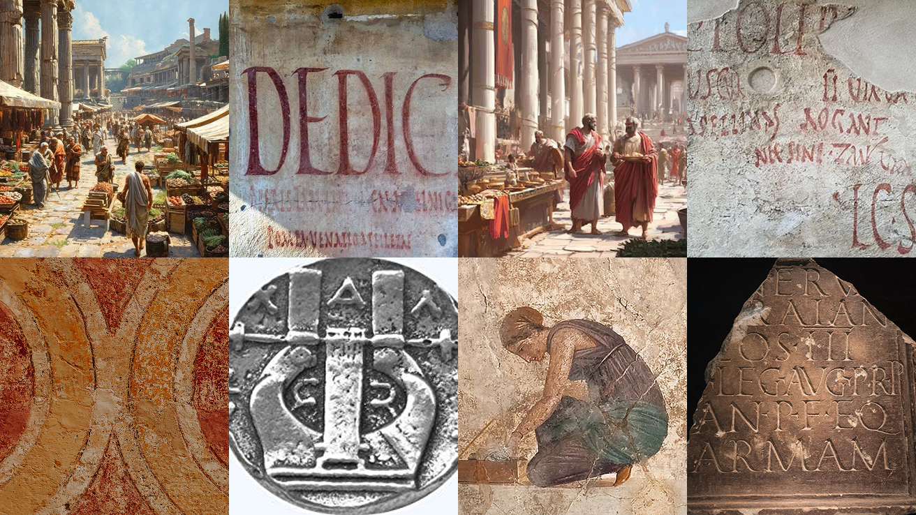
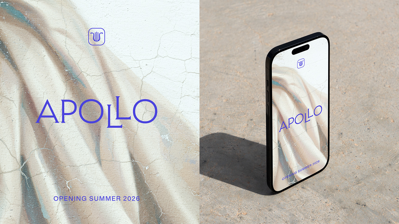
With this as the conceptual undertone, the lyre, a nod to Apollo, is built as a sleek, symmetrical icon. The lyre was a common visual on coins from the classical period, which further ties it to the marketplace. This is balanced by the wordmark, which is built with an elegant, glyphic serif, taking inspiration from the classic stone-carved typography of the Greek and Roman eras.

The design further mimics an old-world marketplace with a diverse collection of traditional and contemporary typography. The glyphic serif, Paradigm, is offset by the modernity of the grotesk sans, Mona Sans. Added visual interest is injected through Almendra, inspired by the hand-drawn frescos found in Pompeii market squares. These are silently supported by Mona Sans used in body copy across print and screen.
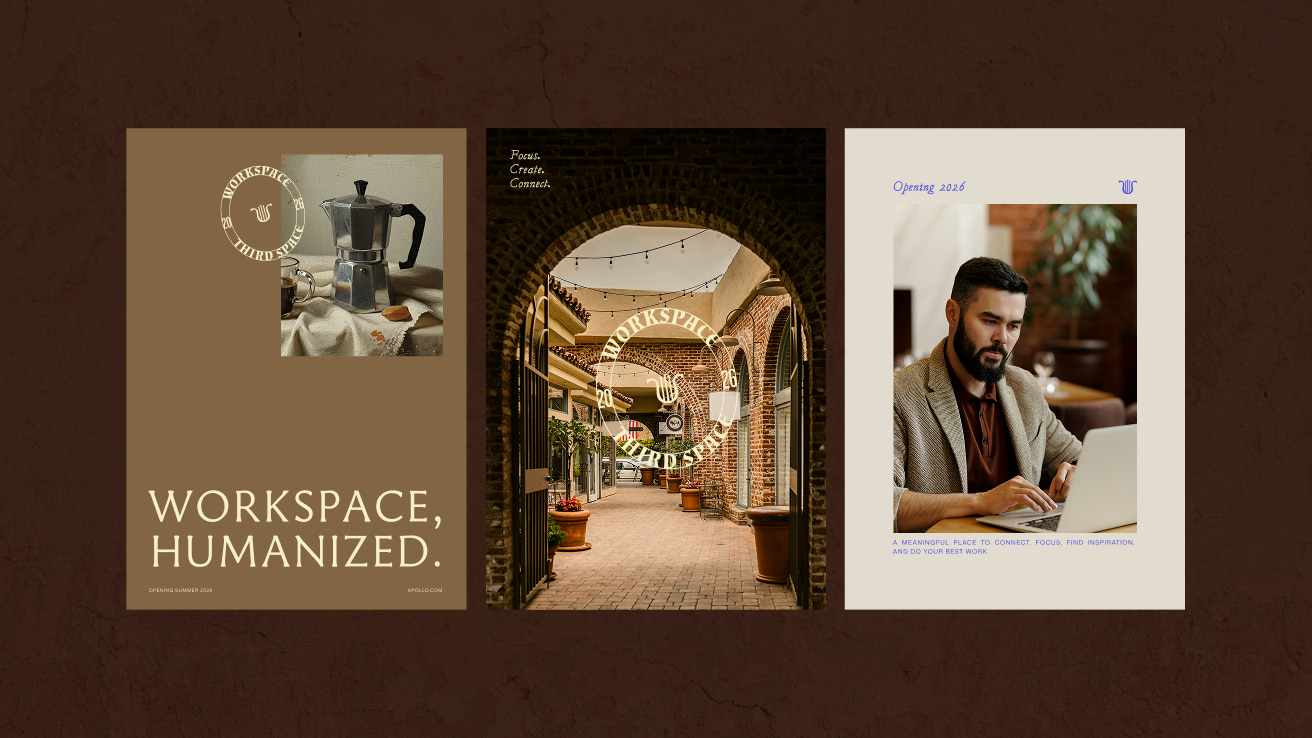
The colour palette brings together traditional and classic hues. The vibrant hues of a bustling marketplace with limited pigments and earthy tones give the brand a sophisticated tone, while the bright digital blue, an expected pop of modernity, cuts through to bring balance.
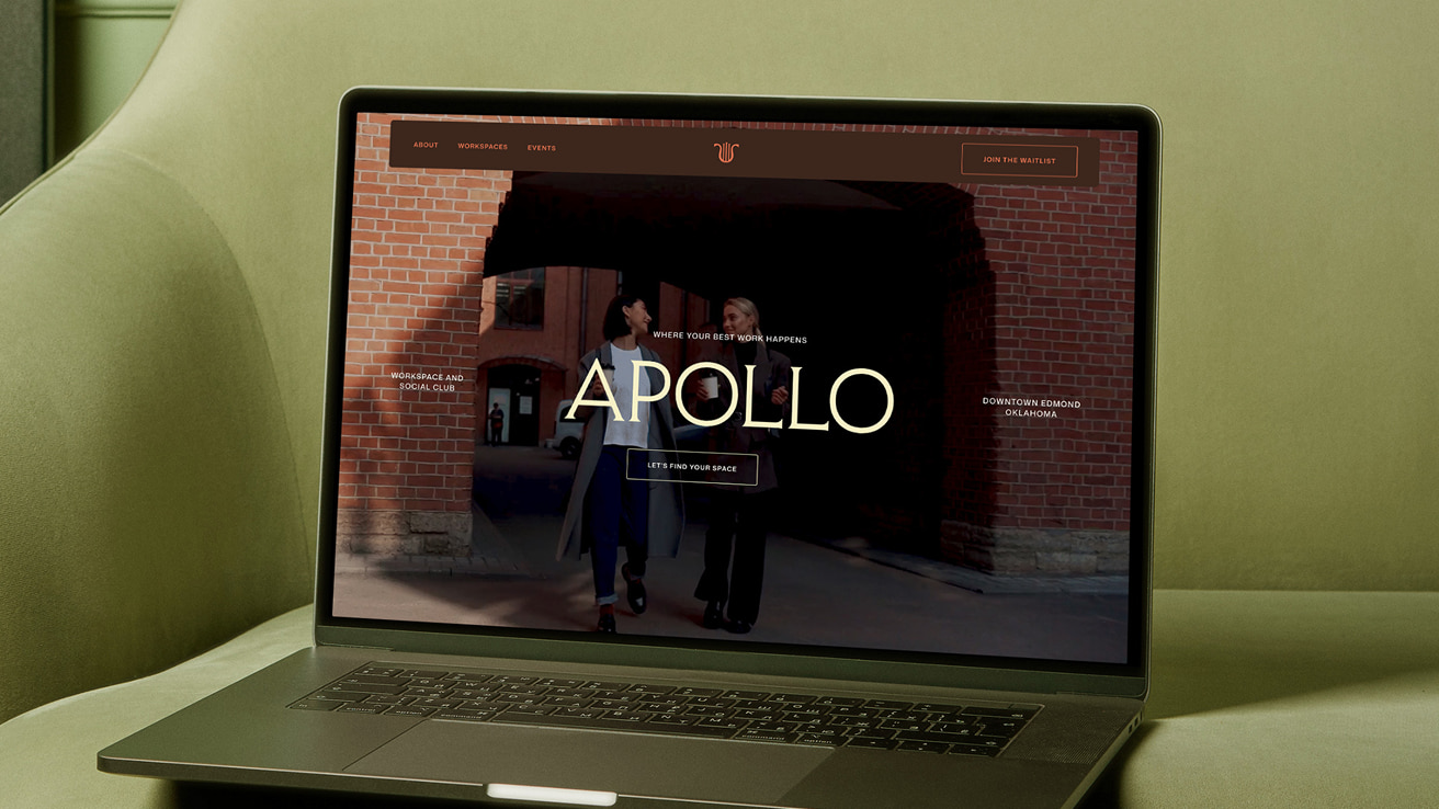
Website
The next step was launching it to the public. The website piece of the puzzle fell into place effortlessly after considerable effort and care were put into the strategy, messaging, and visual guidelines.
The simple 4-page website was quickly designed and developed, and launched with so much buzz and excitement.
We loved partnering with Austin and the Apollo team to bring this vision to life. It’s a brand that feels thoughtful and human, proof that when intention guides every decision, you create something that feels both timeless and fresh. We’re excited to watch this brand grow and thrive (literally).