We’ve been making a big web design mistake.
In the exciting rush to develop websites for the clients we love, we’ve been neglecting their 404 pages. The result has been sad, boring “This page was not found” messages for the world to see.
404 pages present an opportunity to share your brand’s personality and put a smile on your site visitor’s face. An opportunity we haven’t been embracing, until now…
What is a 404 Page?
A 404 page is a landing page that a user sees when they try to reach a page on your website that is unavailable or doesn’t exist. While visitors landing on your 404 page is often inevitable, it can be an annoying detour on their journey to find information or buy your product.
A 404 page exists to let your visitor know they’ve ended up in the wrong place and lead them back to where they were trying to go.
To get this right, your 404 page should include these 3 things:
- A description of what went wrong:
Your user should immediately recognize that something has gone wrong. While ‘404’ is a widely known term, make sure to explain why the error is showing. - CTA buttons to guide them back:
Add key links to important pages that can lead the user to the page they were trying to reach. - And maybe a search box:
While not required, a search box can help users find what they were looking for.
While these elements would get the job done, we believe that sprucing up your 404 page is a smart way to show the user your brand’s personality.
404 But Make It Fun
Your 404 page is a chance to show the human side of your brand. Show that you care with a well-designed, user-friendly error page.
With some clever copy and design and fun design, you can distract the user from the bump in the road and send them back on their way with a smile on their face.
Our team has been on a bit of a journey improving the boring 404 pages we recently built for clients. We updated the UX, copy, and design to highlight the voice and personality of each brand.
To give you an idea of the 404-page possibilities, here are some of our favourite before and afters:
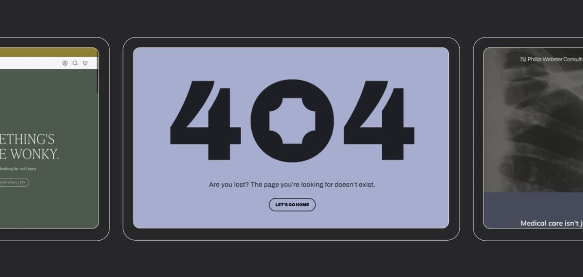
House of Kook
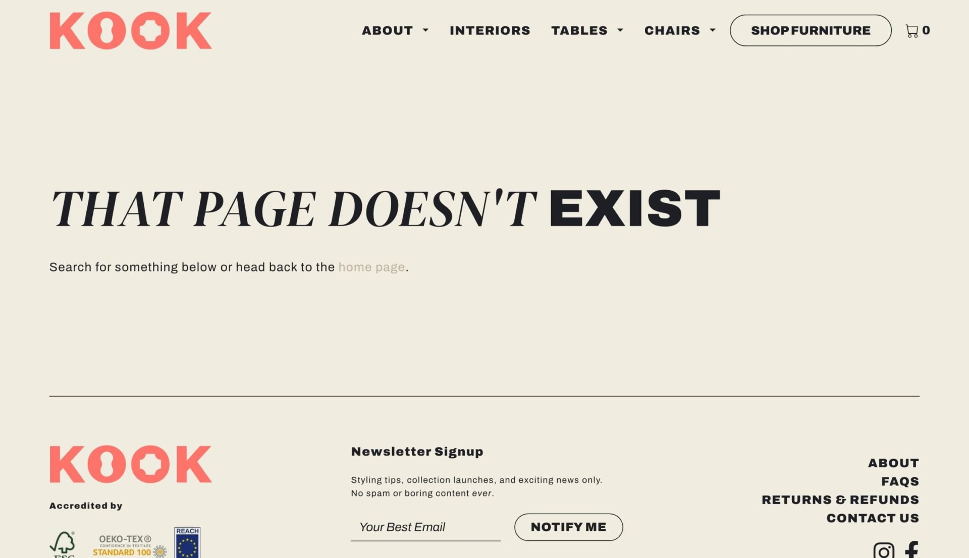
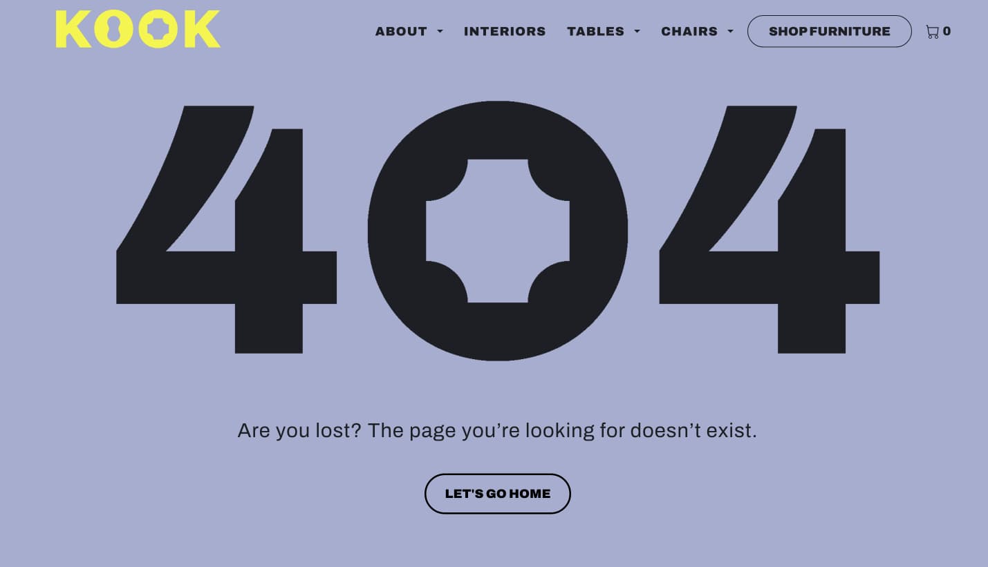
Kook, as the name suggests, is a fun brand that deserves a fun 404 page. Previously, this stood as a boring notice of error with some misleading copy. In our redesign, we used exaggerated scale and elements of their wordmark to add more of Kook’s usual fun energy to the page.
Tip: Don’t settle for a boring CTA button. Consider how you could play on words to communicate who the brand is or what they do. Read more copywriting tips here.
Anna Rosholt
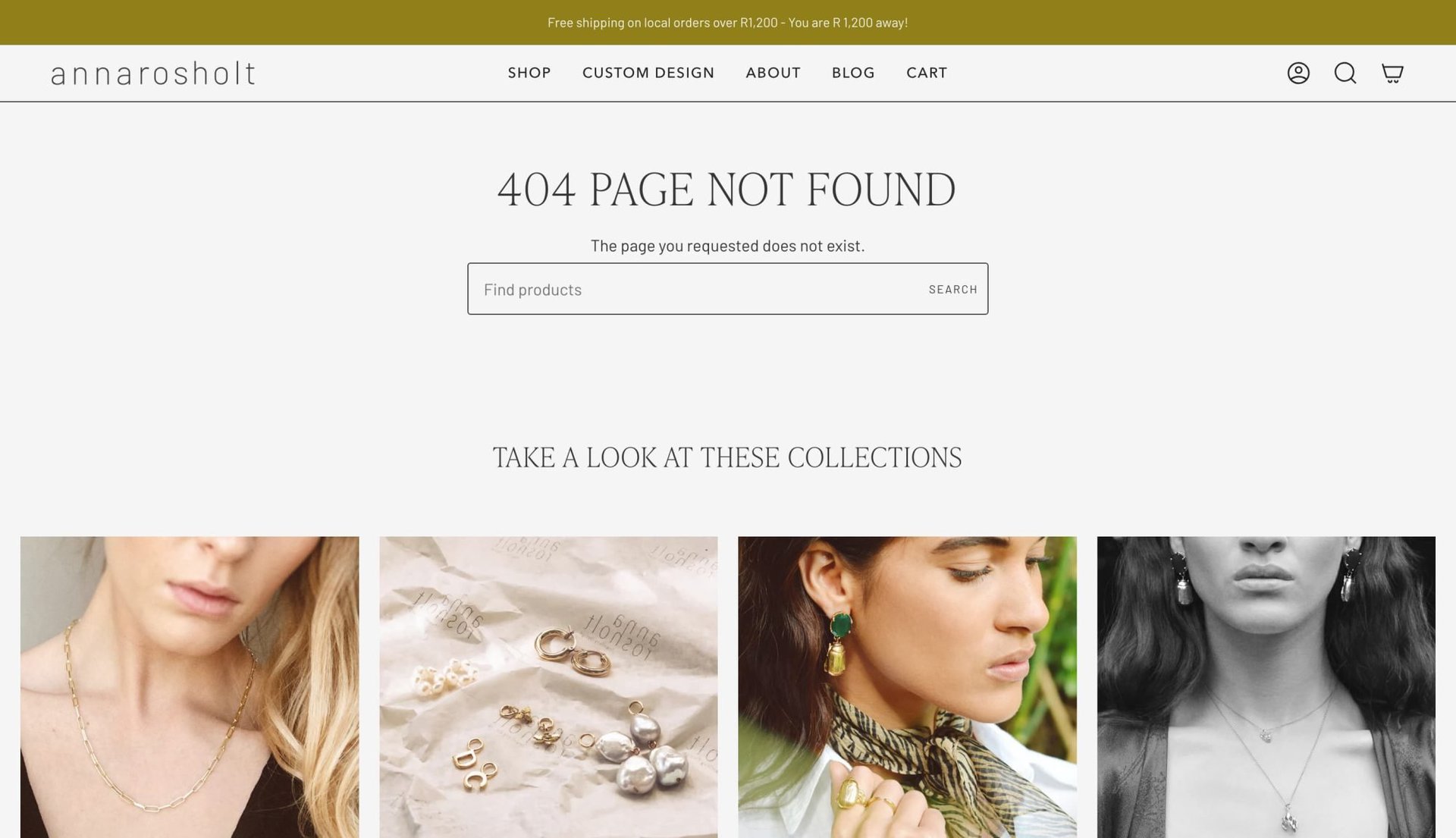
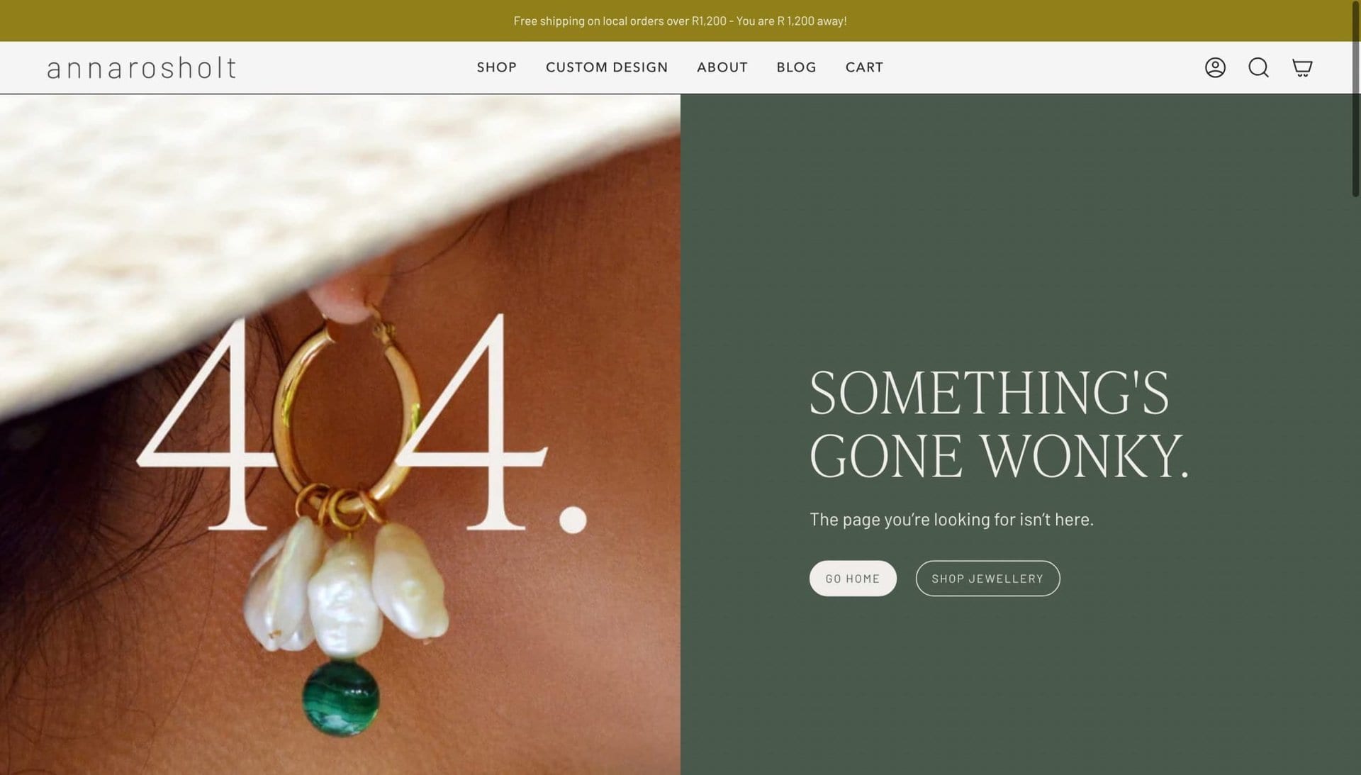
While the old 404 did the trick, the new one is fun, playful and memorable. The play on words (and on image) speaks to Anna Rosholt’s best-selling product, the Wonky Pearl Charm.
Phillip Webster
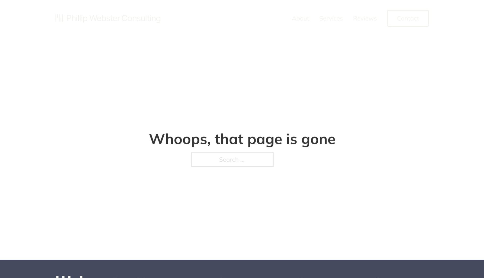
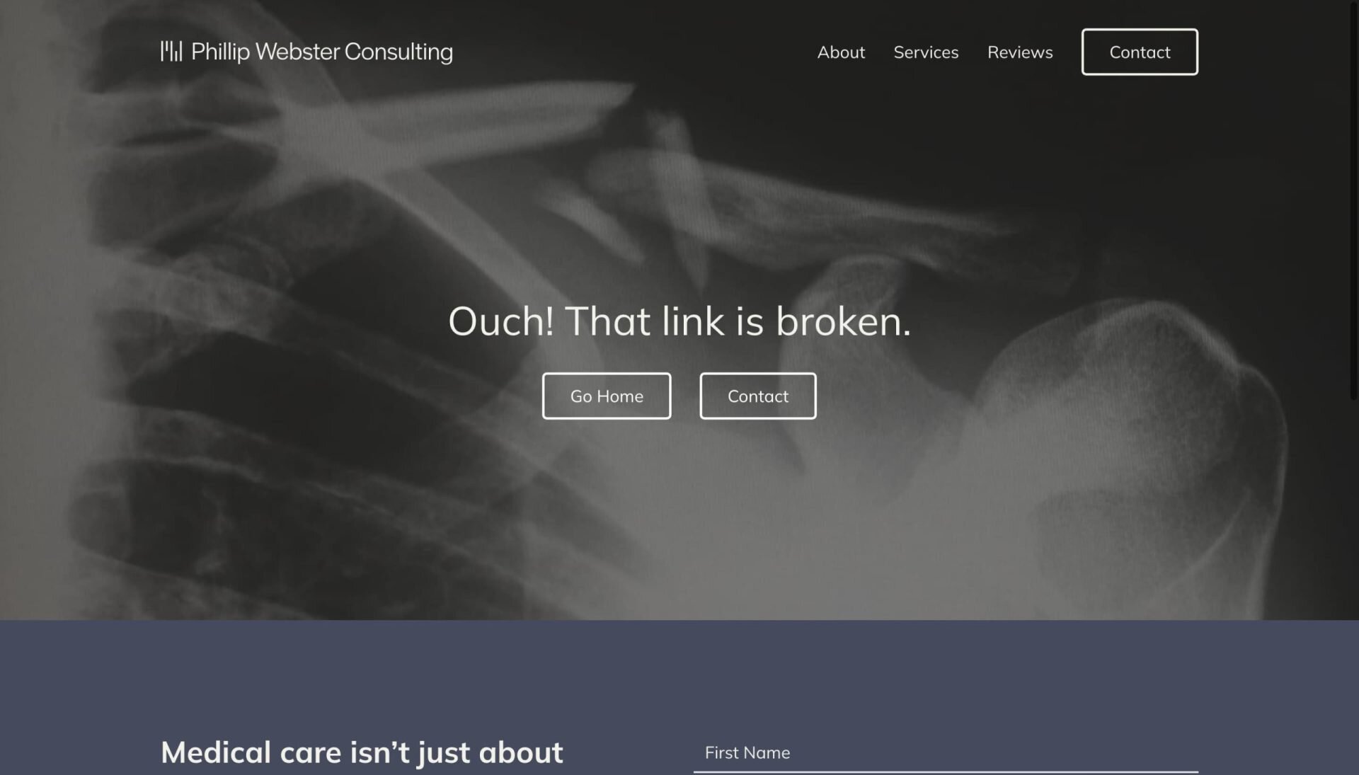
A more serious brand like Phillip Webster can still have fun with 404s. The previously boring error page for this orthopaedic surgeon was redesigned to be funny, warm and friendly.
No More Boring 404 Pages
Don’t make the same mistake as we did and undervalue your website’s 404 page. Rather, turn the frustrating bump in the road into a memorable brand experience. Take the opportunity to be creative, have some fun, and let your customer know that you care about their experience.