One of our favourite (and most beautiful) projects that we’ve completed at Digital Butter is Beaut Serum’s website. This is largely due to Beaut being an extremely fun and aesthetically pleasing brand. Despite feeling proud and happy with our V1 of the website, we decided we could make it even better.
Here’s how we followed UX best practices to make Beaut’s good website even better.
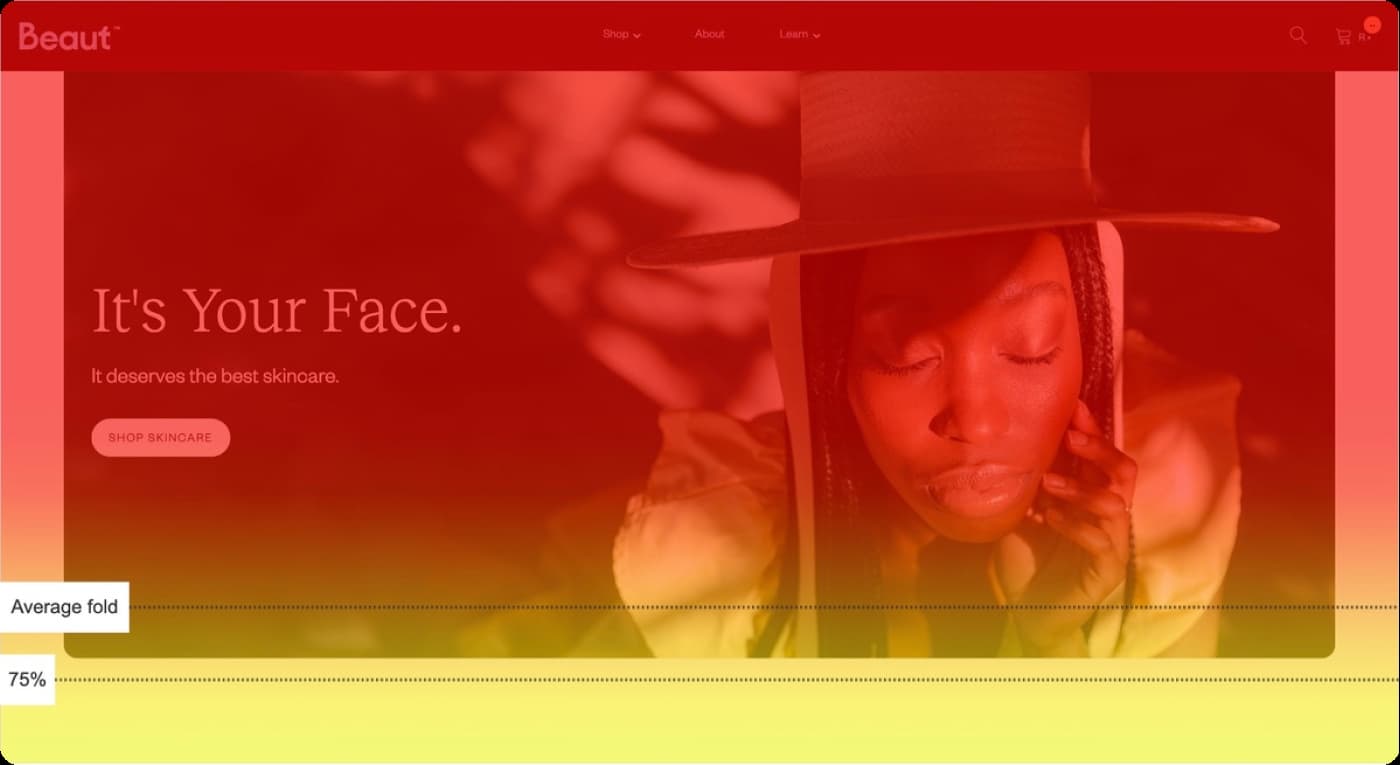
Tool tip: Before we got started, we used heatmaps from Microsoft Clarity to see what visitors were doing when they visited Beaut’s website. With a tool like this, you can see what CTAs aren’t getting clicked and which sections don’t get scrolled past. It provides useful information so you can make data-driven improvements according to how your audience behaves.
Start with the Goal of the Website
Make your intention clear right from the start. Your website’s goal needs to be clear from the second a user lands on the page.
Beaut’s website’s goal is to sell skincare products, but none of its products were featured in the hero section of the homepage. Microsoft Clarity showed us that the majority of users weren’t scrolling below the fold, so we needed to hook them earlier.
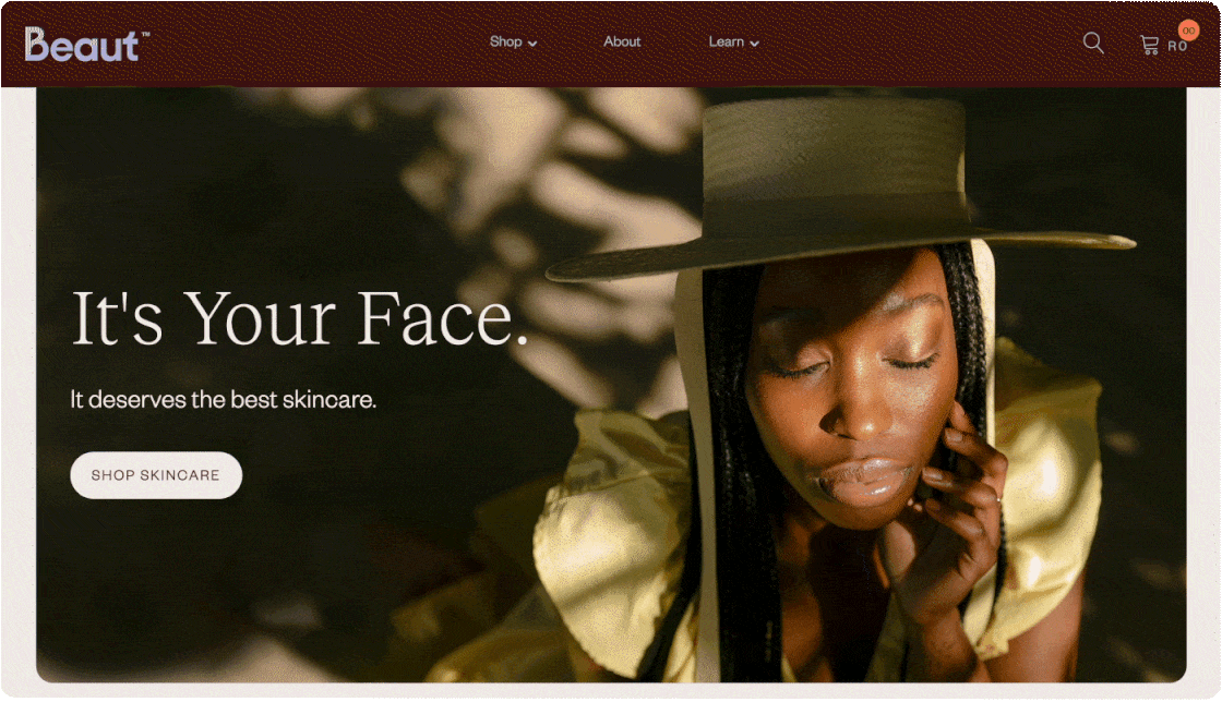
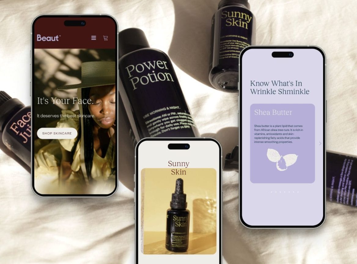
The improved V2 showcases one of Beaut’s products in the hero section with a nifty animation that adds interest.
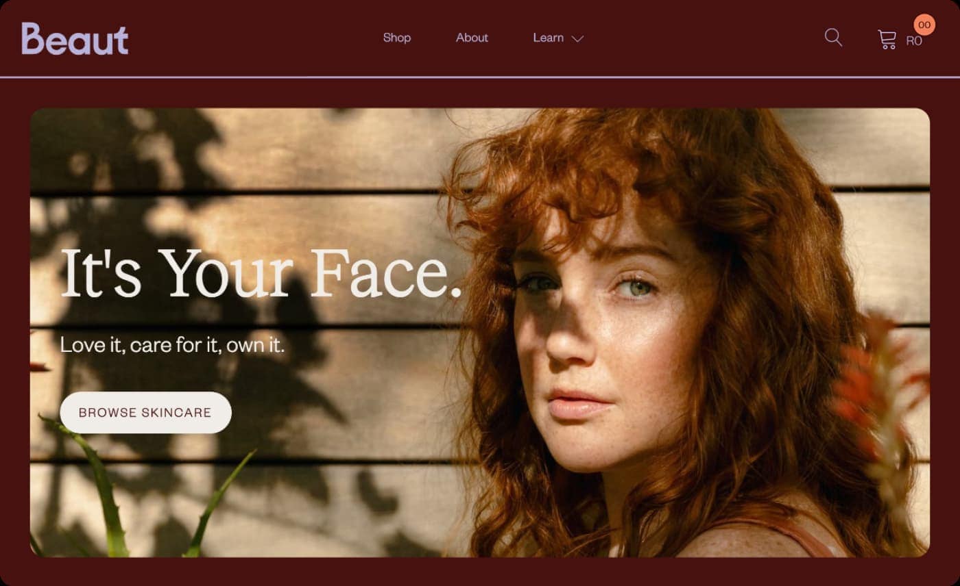
We also changed the hero section copy from “It’s your face. Love it, care for it, own it.” to “It’s your face. It deserves the best skincare.” This new copy makes a clearer case for why your face needs Beaut Serums specifically: because it’s the best skincare.
Hero Section UX takeaway: The goal of your website should be obvious from the second a visitor lands on the page. If Beaut’s goal is to sell skincare products, the hero section needs to feature skincare products.
Prioritising Social Proof
Social proof is an essential aspect of any website because it does three things for your brand:
- Increases credibility
- Taps into the innate human need to fit in
- Helps visitors envision themselves using your products
Don’t know what social proof is? Here’s a handy blog we wrote about it.
Let’s take a closer look at the three changes we made to the social proof on Beaut’s website.
- Improving testimonial appearance
Beaut V1’s testimonials were large colourful blocks that may have read more as images than testimonials. We addressed this by simplifying and shrinking down the design.
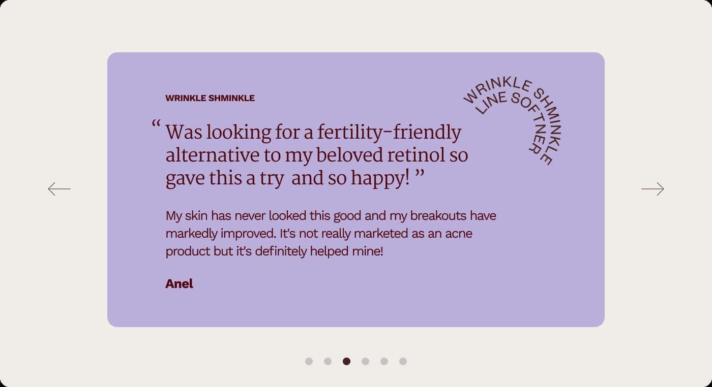
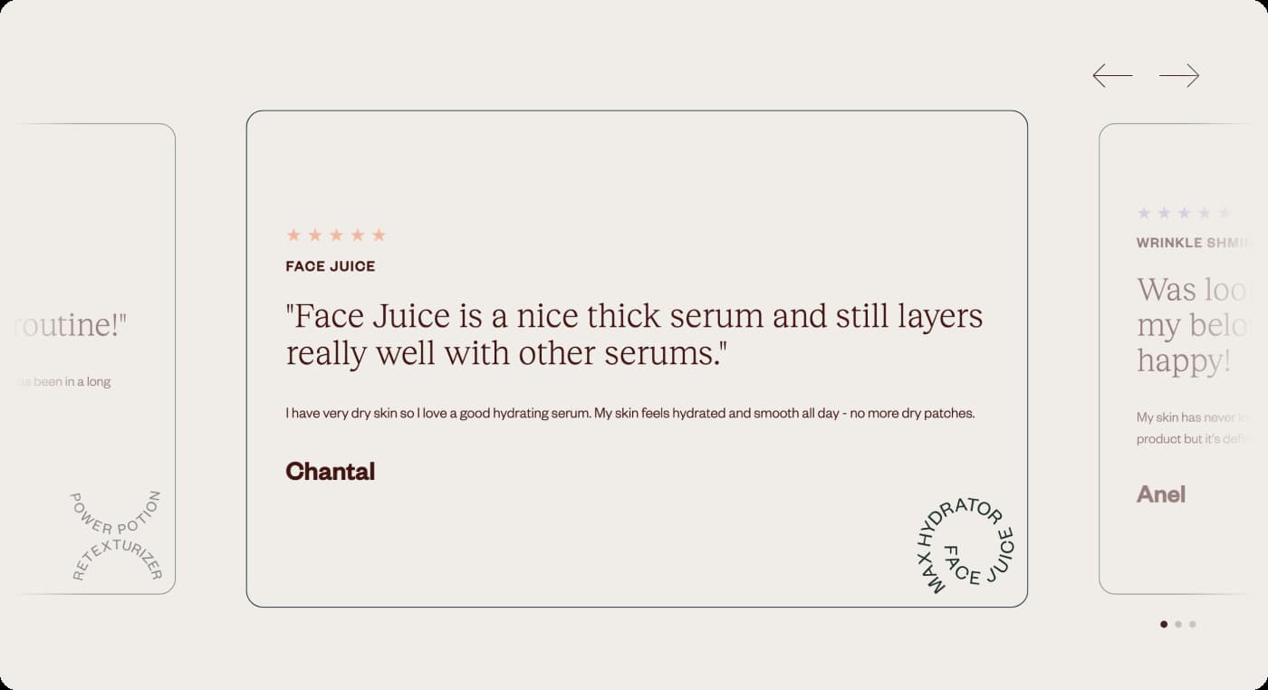
Now, Beaut’s testimonials are the same colour as the background and users can see the next and previous testimonial poking out on either side of their screen as well as a left and right arrow. This makes it clearer that there are more to see and that they are scrollable.
We also added stars because they’re the universal symbol for reviews and, as a result, site visitors can immediately recognise that these are testimonials.
- Adding an ‘as seen in’ banner
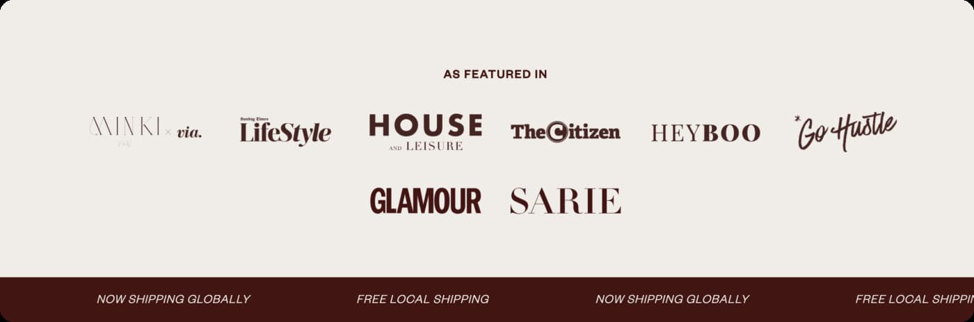
Beaut is a small business which means that many consumers don’t know or trust them just yet. The ‘as seen in’ banner tells users that Beaut is recognised by trusted brands such as Glamour and Sarie. When users see these familiar icons, they will instantly feel at ease about Beaut’s reputability.
This is a really easy way for smaller businesses to gain the trust of their site visitors through their trust for bigger brands. If you’re a small business and you haven’t been ‘seen in’ anything yet, why not try a PR campaign and get your name out there?
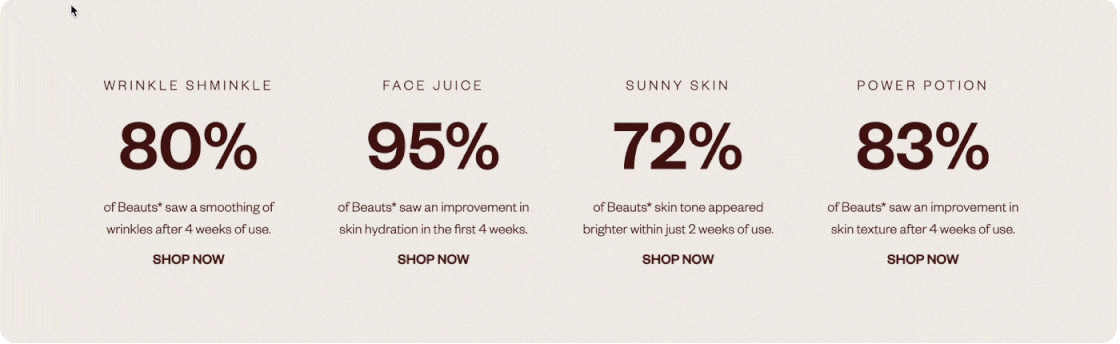
- Making trial statistics shoppable
Beaut has some very impressive results from a trial they ran with 82 women between the ages of 25 and 60. The results speak for themselves and we’ve always had them on the website – but they weren’t shoppable.
Making things as easy as possible for the customer to get from A to B is at the centre of UX best practices. Resultantly, showing off these statistics and then expecting the customer to scroll back up to the product and click on it in another menu was holding the site back.
Now, when you hover over each trial statistic, a “Shop Now” button appears. This makes the website more engaging and interactive but also means that if visitors feel impressed by the results, they can go straight to the product page to convert.
Social Proof UX takeaway: Social proof needs to be a priority throughout your website, but it also needs to be user-friendly. Our improvements to Beaut’s website mean that users can engage with and shop the social proof in the easiest way possible.
Finding the Right Transitional Call to Action
Because the main goal of Beaut’s website is to sell skincare products, the primary call to action (CTA) of the website is to shop skincare. But we needed to choose and hero a transitional call to action for visitors who aren’t ready to buy the products just yet.
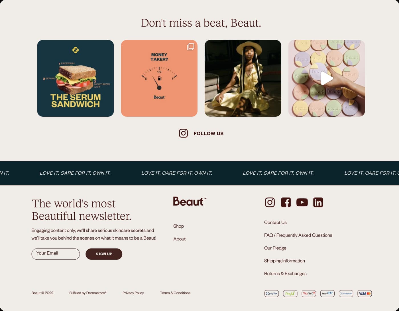
On V1 of the website, the bottom section of the page was dominated by a cheery orange CTA to sign up for Beaut’s newsletter. The design created a block across the whole screen which might have been keeping visitors from the last bit of the page below it.
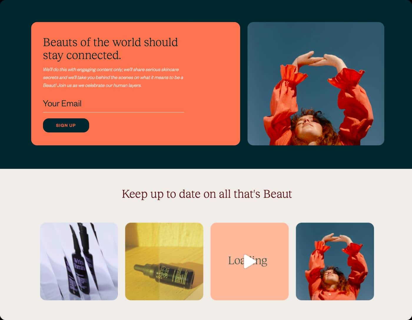
But Instagram is Beaut’s main touchpoint with their audience, not their newsletter. We decided to move the newsletter signup into the footer and make the Instagram CTA much clearer. We added a catchier heading and a “Follow Us” button with Instagram’s recognisable icon.
CTA UX Takeaway: Your website should be like the yellow brick road that guides users to take action. If your site visitor gets to the bottom of the page and hasn’t clicked on your primary CTAs, you need to guide them to the next best thing with your transitional CTA. A website has failed if it doesn’t guide users toward its goals.
Bonus: The Blog Didn’t Need a Title (and yours probably doesn’t either)
We decided that giving the blog section of the homepage a title wasn’t necessary. When users see a section title like “Read our journal” they tend to gloss over it because they’re not looking to read journals, they’re looking to gain value.
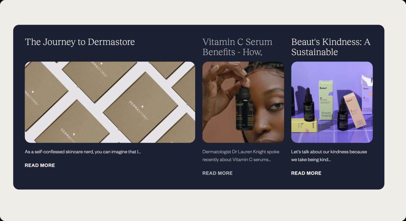
Instead, we chose to draw attention to the titles of the blogs themselves. “How to layer serums” clearly indicates how it’s going to deliver value for the reader far more than “Read our journal” does.
Blog Title UX Takeaway: In Beaut’s own words, your website copy should be all good stuff and no fluff. Get rid of the unnecessary fluff that’s blocking your users from getting to the good stuff.
–
If you only take one thing away from this case study, it should be that there is always room for improvement. We were already extremely proud of the work we did on V1 of Beaut’s website but we could still see its potential for improvement.
Do you like the look of Beaut Serums? Shop their skincare products or take a closer look at their website design here.