Brand guidelines act as rules to keep your brand consistent when applied across different platforms and contexts. This consistency makes for a strong brand identity which builds loyalty and trust with your customers.
Today, we’ll use examples from work we did for our client Alison from Alison Bradfield Physiotherapy to show you five elements you should have in your brand guidelines to make it more powerful and versatile so it works on every platform, every time.
Let’s check them out.
1. Mood Board
It’s essentially your brand strategy made visual. Once you’ve got this, you can use it to create your new visual identity to be consistent in style and aesthetic with your goals and expectations.
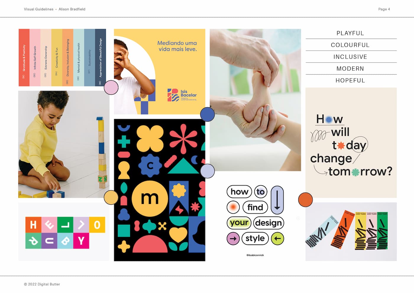
A mood board is an important brand-building tool. It’s a collection of images, designs, fonts, symbols, and colours that represent your brand.
Try to think of your mood board as a roadmap which will guide your design choices but won’t necessarily translate to your final design. So you don’t need to fixate on individual elements but rather decide if the overall look and feel communicate the mood or theme of your brand.
Here’s the mood board for Alison Bradfield Physiotherapy. Alison is a physiotherapist working with children so we wanted it to be playful, colourful, inclusive, modern and hopeful.
2. Colour Palette
Researchers have found that up to 90% of snap judgments made about products are based on colour alone. This research has also shown that the relationship between brands and colour hinges on the perceived appropriateness of the colour used for the particular brand.
In other words: Does the colour fit what’s being sold?
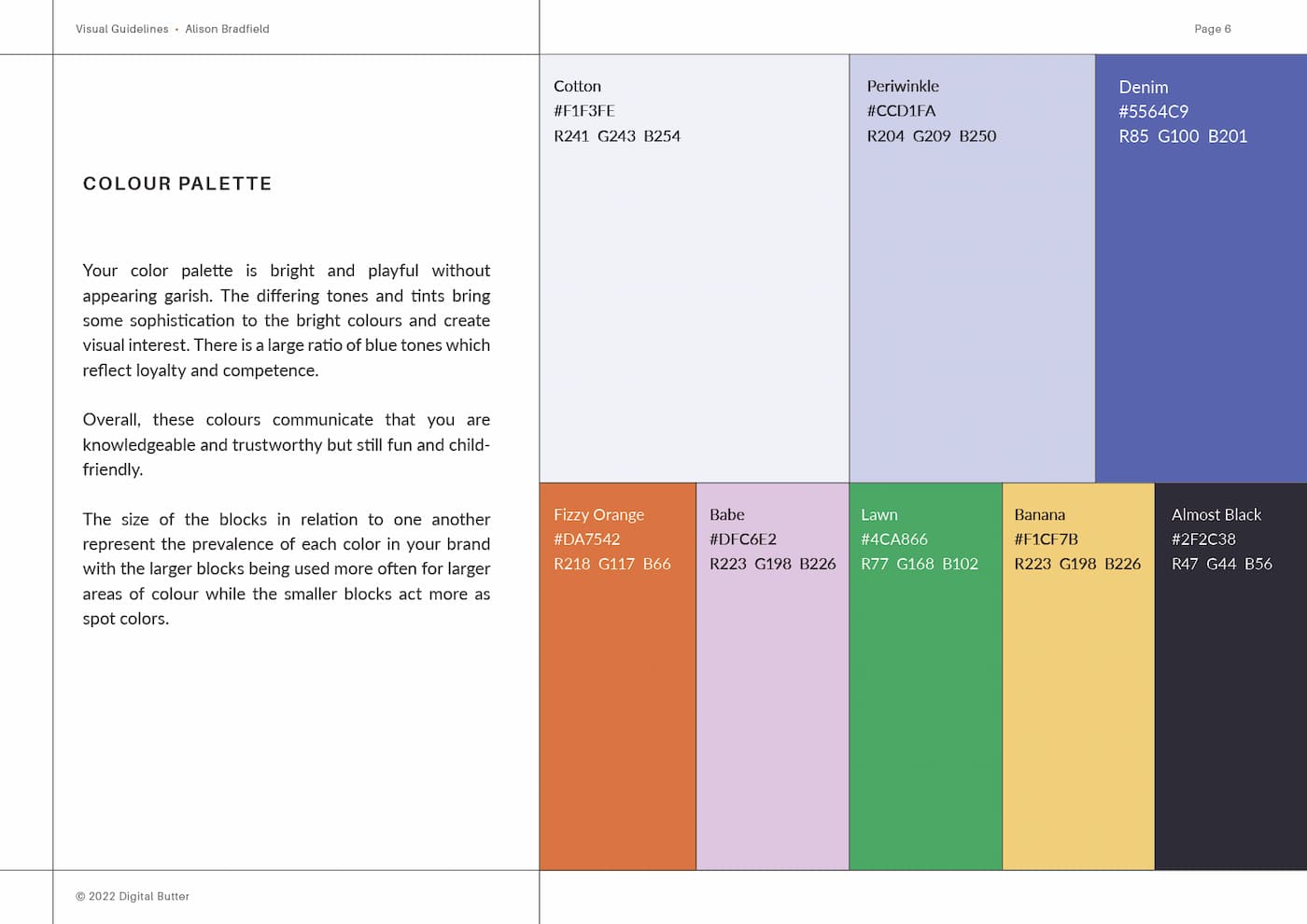
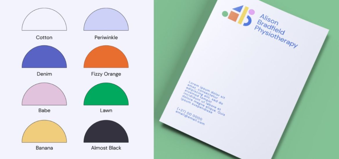
Alison’s colour palette is bright and playful without appearing garish. The differing tones and tints bring some sophistication to the bright colours and create visual interest. There is a large ratio of blue tones which reflect loyalty and competence. Overall, these colours communicate who you are knowledgeable and trustworthy but still fun and child-friendly.
3. Logo & Brand Assets
The logo is the foundation for your brand identity. It’s often your first impression and is how your customers recognise you. Keep it simple, make it scalable, and ensure that it works in greyscale.
Your main logo is referred to as your primary logo and there’s a good chance it isn’t going to fit on every piece of brand material that you make. That’s why you also need a secondary logo and sub-mark.
A secondary logo is your main logo, but different. If your main logo is long horizontally, then maybe your secondary is stacked differently so that it takes up more vertical space.
An icon or sub-mark is a simplified version of your main logo. It usually doesn’t contain your brand name so it can be made smaller while still being able to read it.
There are no fixed rules here. You can have multiple secondary logos and sub-marks in all kinds of different formats. All you need to worry about is that all the logos are cohesive and then you’re good to go.
Have a look at Alison’s logo system.
4. Typography
Typography refers to fonts used across your branding. You should aim to choose one font, that has multiple styles including bolds and italics so you can differentiate headlines and body copy. However, you can also use more than one font if it makes sense for you.
These are a few tips for choosing your brand fonts. Make sure your fonts:
- Are easy to read
- Are optimized for print and web
- Work in numerous sizes
However, the most important thing to keep in mind when you choose your fonts is that they’re there to be read. If you choose fonts that are too designed, your message will get lost and you’ll probably lose business too.
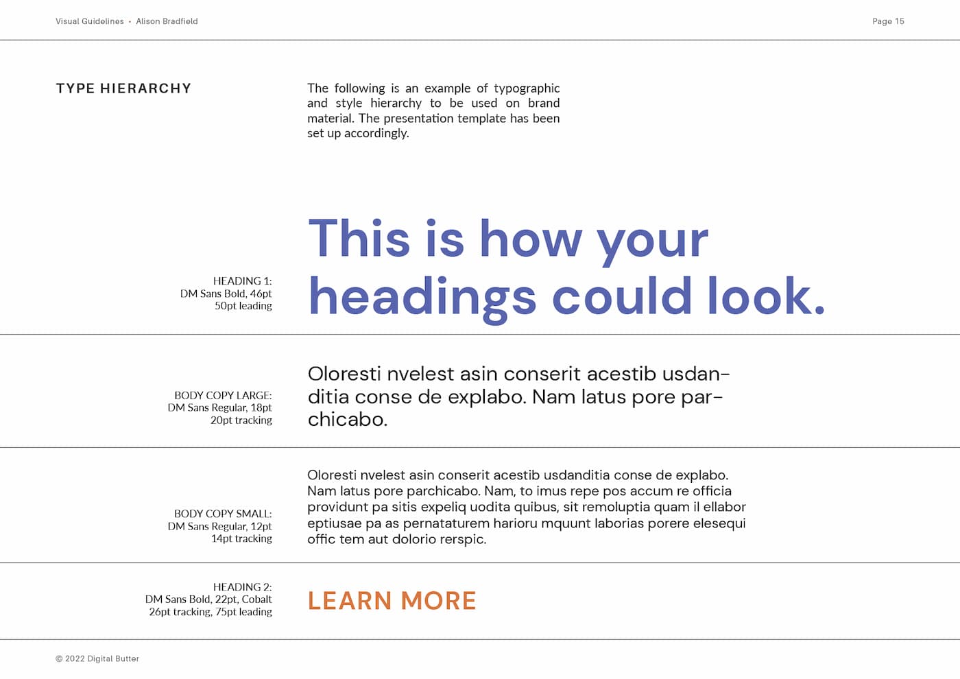
For Alison’s typography, we went with DM Sans in different weights and sizes to create a hierarchy within the brand material. We also suggested Trebuchet MS as a Microsoft friendly typeface for instances where she works on Word or Powerpoint. Both of these fonts are geometric and, most importantly, easy to read.
5. Collateral Assets
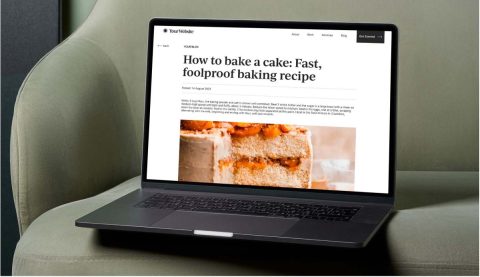
The collateral assets are all of the little things that you need when getting your brand out there in the world. This will differ from brand to brand. For example, Alison needed an email signature, business cards, and social media templates.
If you do lots of presentations or like handing out flyers, you’ll need a presentation deck and flyer designs to be included in your collateral. If you’re selling physical products, your collateral will include packaging design.
For Alison’s social media templates, we used Canva so she could go back and edit them without needing expensive and difficult to use software such as Figma or Adobe.

Once you’ve got these five things sorted, your brand guidelines will be good to go. You can combine them into one PDF and refer back to them to keep your brand consistent.
If you’d like our help with putting together your brand guidelines, you can talk to us here.